How to use the Color Tokens from your Design System directly in Tailwind CSS

In a previous blog post, we explained what Design Systems are.
Here, I will explain how to easily develop a tool to use the tokens defined in a Design System build with Figma, for a site or a UI component library using Tailwind CSS.
What is Figma?
Figma is a collaborative design tool for design, prototype, and design systems.
When creating a Design System, the first step is to define the tokens: colors, spacing, typography, and styles, etc., and then use these tokens in all Figma components as well as in the code, keeping these tokens up to date.
Figma Token Plugin
To use/create tokens in Figma, you must first install the Figma Token Plugin.
This plugin will allow us to create tokens and use the token references throughout Figma. This tool allows you to create various themes. For example, create light/dark site themes, or create different theme versions of the site.
Transform Token.json to CSS variables files from Figma
With the Figma Token Plugin we can export the token to a JSON file.
We'll write a script that uses the Figma Token plugin export and StyleDictionary (from Amazon) to generate css-variables with references and consume them in the tailwind configuration.
Style Dictionary is a library that allows us to generate variables and style files for various applications (web, native,...), frameworks, and so on.
The pre-scripts (token-transform)
For our example, we'll use this example file from Figma Token.
This file is already quite complete; it contains a list of global color tokens as well as two light/dark themes that make use of global colors.
We will use the token-transform (a script from Figma Tokens), to divide the file into 3 parts:
• global.json
• light.json
• dark.json
Like this:
> npx token-transformer tokens.json styles/tokens/global.json global
> npx token-transformer tokens.json styles/tokens/light.json global,light,theme --resolveReferences=false
> npx token-transformer tokens.json styles/tokens/dark.json global,dark,theme  --resolveReferences=false
We keep the variables, to generate colors in each of the files with the following command "--resolveReferences=false".
The script
/* eslint-disable no-console */
const StyleDictionaryPackage = require('style-dictionary')
const global = require('./styles/tokens/global.json')
const light = require('./styles/tokens/light.json')
const dark = require('./styles/tokens/dark.json')

const supportedTokenTypeList = [
  'color',
]

const formatValue = (tokenType, value) => {
  let formattedValue
  switch (tokenType) {
    case 'color':
    default:
      formattedValue = value
  }
  return formattedValue
}

/**
 * Custom format that handle reference in css variables
 */
StyleDictionaryPackage.registerFormat({
  name: 'css/variables',
  formatter({ dictionary }) {
    return `${this.selectorName} {
      ${dictionary.allProperties
        .map((token) => {
          const value = formatValue(token.type, token.value)

          if (dictionary.usesReference(token.original.value)) {
            const reference = dictionary.getReferences(token.original.value)
            const referenceName = reference[0].name
            return `  --${token.name}: var(--${referenceName}, ${value});`
          }

          return `  --${token.name}: ${value};`
        })
        .join('\n')}
    }`
  },
})

/**
 * Custom format that generate tailwind color config based on css variables
 */
StyleDictionaryPackage.registerFormat({
  name: 'tw/css-variables',
  formatter({ dictionary }) {
    return (
      'module.exports = '
      + `{\n${
        dictionary.allProperties
          .map((token) => {
            const value = formatValue(token.type, token.value)
            return `  "${token.path
              .slice(1)
              .join('-')}": "var(--${token.name}, ${value});"`
          })
          .join(',\n')
         }\n}`
    )
  },
})

/**
 * Returns the files configuration
 * for generating seperated tailwind files.
 */
function getConfigTailwindFilesByType(typeList) {
  return typeList.map((typeName) => {
    return {
      destination: `tw-extend/${typeName}.js`,
      format: 'tw/css-variables',
      filter: {
        type: typeName,
      },
    }
  })
}

// HAVE THE STYLE DICTIONARY CONFIG DYNAMICALLY GENERATED
function getStyleDictionaryConfig(tokensConfig = {}) {
  const { brand, buildTailwindFiles, tokens, selectorName } = tokensConfig

  let configTailwindFilesByType = []

  if (buildTailwindFiles) {
    configTailwindFilesByType = getConfigTailwindFilesByType(
      supportedTokenTypeList,
    )
  }

  return {
    tokens,
    platforms: {
      web: {
        transformGroup: 'web',
        prefix: 'ui',
        buildPath: './styles/',
        files: [
          {
            destination: `${brand}-variables.css`,
            format: 'css/variables',
            selectorName,
          },
          ...configTailwindFilesByType,
        ],
      },
    },
  }
}

console.log('Build started...')

const configs = [
  // PROCESS THE DESIGN TOKENS FOR THE DIFFEREN BRANDS AND PLATFORMS
  {
    brand: 'global',
    buildTailwindFiles: false,
    selectorName: ':root',
    tokens: global,
  },
  {
    brand: 'dark',
    buildTailwindFiles: false,
    selectorName: '[data-theme="dark"]',
    tokens: dark,
  },
  {
    brand: 'light',
    buildTailwindFiles: true,
    selectorName: '[data-theme="light"]',
    tokens: light,
  },
]

configs.map((config) => {
  console.log('\n==============================================')
  console.log(`\nProcessing:  [Web] [${config.brand}]`)

  const StyleDictionary = StyleDictionaryPackage.extend(
    getStyleDictionaryConfig(config),
  )

  StyleDictionary.buildPlatform('web')

  console.log('\nEnd processing')
})

console.log('\n==============================================')
console.log('\nBuild completed!')
How does it work?
1. The script loads the 3 JSON token files
2. Register 2 custom "formatters":
• css/variables
• tw/css-variables
3. Launch style-dictionary with the function buildPlatform('web')
4. Build 3 CSS files:
• styles/global-variables.css
• styles/light-variables.css
• styles/dark-variables.css
5. Build a javascript file to use in tailwind.config.js
• styles/tw-extend/color.js
Note: you can find the files here.
Create an application to test it
To put it to the test, we will create an application that uses Tailwind.
To get started quickly, we'll use Nuxt3.
1. Install Nuxt
npx nuxi init nuxt-app
cd nuxt-app
npm install
2. Install tailwind module nuxt3
npm install --save-dev @nuxtjs/tailwindcss3. Add it to your modules section in your nuxt.config.ts
export default { modules: ['@nuxtjs/ tailwindcss']}4. Create the tailwind.config.js
npx config file tailwindcss init5. We modify the app.vue file to see that we are using tailwind
...
    <span class="text-green-500">Green</span>
...
6. We start the dev server
npm run dev7. And we open the browser on http://localhost:3000
Extend the Tailwind colors with our tokens
We will extend the tailwind colors with our file in "tailwind.config.js"
const colors = require('./styles/tw-extend/color')

module.exports = {
    // …
    theme: {
    	extend: { colors },
    },
    // …
}
And use our new classes in the app.vue
<span class="text-fg-default">Color from the Design System</span>Use files css-variables for the light and dark theme
We will create the file assets/css/main.css
@import "../../styles/light-variables.css";
@import "../../styles/dark-variables.css";
And update app.vue to add a dark-mode toggle button
<script lang="ts" setup>
import './assets/css/main.css'
const isDark = ref(false)
const toggleDarkMode = () => {
isDark.value = !isDark.value
if (isDark.value)
document.documentElement.setAttribute('data-theme', 'dark')
else document.documentElement.setAttribute('data-theme', 'light')
}
const buttonLabel = computed(() => {
return isDark.value ? 'Light' : 'Dark'
})
</script>
<template>
<div class="text-fg-default bg-bg-default">
<button
class="h-10 px-6 font-semibold rounded-md bg-bg-default text-fg-default border-solid border-fg-default border-2"
@click="toggleDarkMode"
>
<Icon v-if="isDark" name="heroicons-outline:sun" />
<Icon v-else name="heroicons-outline:moon" />
{{ buttonLabel }}
</button>
</div>
<div>
<div class="flex justify-center items-center h-screen bg-bg-default">
<div class="grid gap-4 grid-cols-2 grid-rows-2">
<button
class="h-10 px-6 font-semibold rounded-md bg-bg-default text-fg-default border-solid border-fg-default border-2"
>
Primary
</button>
<button
class="h-10 px-6 font-semibold rounded-md bg-bg-muted text-fg-muted border-solid border-fg-muted border-2"
>
Secondary
</button>
</div>
</div>
</div>
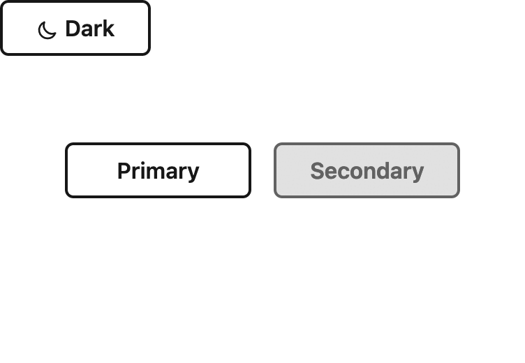
</template>In the image below, we can see that when we click on the toggle button, the theme of the page switches from light to dark.
And Voila! We’ve successfully integrated the tokens from Figma Tokens into the application 🎉
You can find the completed code here: https://github.com/mirahi-io/figma-tokens-example-tailwindcss-using-css-variables-reference
Conclusion
It is important for design system teams to use such a script in order for design token data to flow between design and development tools.
This examples shows how simple it is to write a script to use tokens in your application, and it can be adapted for other tools such as:
• Figma alternatives such as Sketch
• Bootstrap, whose latest versions use tons of new CSS variables
• CSS-in-JS framework like Stiches, Pinceau 🖌
• other frameworks such as Next.js, ...
Of course, if you have any questions, feel free to reach out!
Read our blogpost about Designs Systems