How to define numeric accessibility and how to use it correctly
Accessibility can be defined as the ability to access web interfaces, this practice is mandatory for developers and organizations that want to create high quality websites to provide equal access and equal opportunity to people with all kinds of abilities. In this blogpost, we will learn the fundamentals of accessibility, how we can integrate it on our web development workflow and how to avoid common mistakes.
1. How to define numeric accessibility ?
Numeric accessibility (“a11y”) allows users with disabilities to access digital content and services without discrimination. By creating an accessible interface for your product is also offering a better experience for all kinds of users, accessibility is a great way to set up a system of inclusiveness and a better ergonomy.
Accessibility is now a core element of product development, besides including people with disabilities, designing your website by using this digital tool represents a significant lever for their integration, and often gives them independence in their web experience. Accessibility facilitates access to content for all users, including search engines, many accessibility criteria follow SEO needs.
2. Context
Considering that 15% of the world's population has some form of disability, building accessible products should be taken seriously. Actually, is it now legally mandatory for all products from the public services area to be accessible. More than that, every public organism should now provide an accessibility statement for their product.
Depending on the different types of disabilities, what should be taken into account and how to test it ?
Well, we can list 4 types of disabilities:
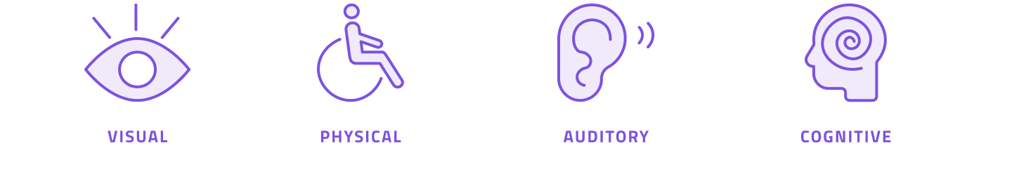
From those four types, we can list different accessibility problems frequently seen on the Web:
VISUAL:
- Images don’t have alternative text
- Button or Links that don’t give information about where it links to or icon CTA with no aria-label about what the action does
- No information or title on iframe
- Not enough contrast for content
- Content not sorted explicitly, not able to refers to content hierarchy while using a reading device
PHYSICAL:
- No keyboard navigation
- Need to touch mouse and keyboard at the same time to navigate
- No focus information displayed while using keyboard navigation or not in the right order
AUDITORY:
- No description text provided for audio source or video
- Sound signal without caption
- Web services using only voice interaction
- Media players with no text-sizing and colors options for subtitles
COGNITIVE:
- Misuse of structural elements on a page
- Too specific language
- Structural navigation not relevant
- Action steps too complex and too long
Now that we have listed some current accessibility problems, here are my tips to avoid them easily when you’re working on a project !
3. Semantic Basics
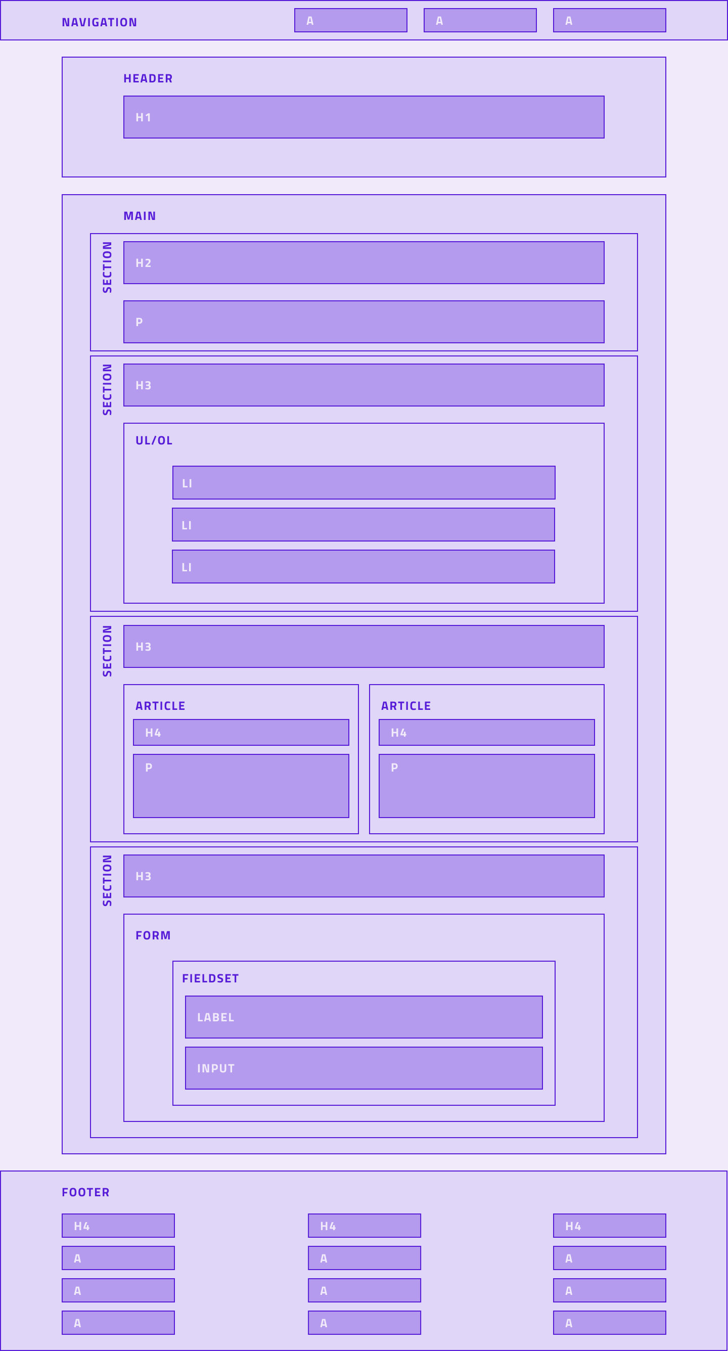
The first action to take while working on a project is to clearly define the structure. Your content should be displayed in a logical and comprehensive way.
To start with, you should use a lang attribute on the html element. With that information, the screen reader will be able to read the information with a correct accent according to the language it’s written in.
Next step is to ensure that the content follows a linear and hierarchic flow; you should split your page into sectioning elements starting with your page’s title, and don't forget that your code should reflect the visual structure.
For a correct heading hierarchy, only use one H1 per page, then use the following heading (h2 to h6) for a section depending on the importance of the content.
Some elements should always be present on a web page:
- Html element with a lang attribute
- Title element of the page
- Navigation element for menu and submenu (complete information of the website’s scope) should be displayed in a logical way for the user to navigate on it
- Header and Footer element
- Main element to showcase content
- P element for paragraph
For specific case scenario :
- if you use a form on your page, you’ll need a form element with :
- a fieldset to group the same input’s type
- a label corresponding to each input
- an input with autocomplete when it’s appropriate
- an error message associated to the corresponding input after submission
- visual form state visible with text after submission
- You can use the article element for blocs that can be read independently from the rest of the content
- If you use image you should ALWAYS give an textual alternative to it
💡 Try to avoid floating elements, they generally create inconsistencies between visual order and source code order.
4. Content
Your content must be understandable for everyone, write in clear language, avoid redundancies and specific terms; keep your action steps simple and intuitive, remove unnecessary steps or fields.
If you’re trying to make your user fill a task, limit distractions on your page (sound, gif, video) and provide a way to stop a movement or sound (pause).
Not everybody understands a task the same way, give your users enough time to complete their actions.
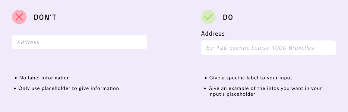
When they submit a form that has errors, showcase directly below the concerned input what is expected on that field, don’t let your users struggle to find the right answer you’re waiting for.
In general, on form, give all the contextual information you need directly on your input; like that you’ll be able to easily give the user all the information he needs to complete the action and to avoid frustration
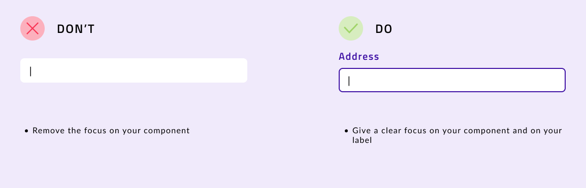
5. Focus
For people that use keyboard navigation, it’s mandatory to have visual information about where the user is on the page. Generally the html element came with the focus information set directly, never remove the focus indicator on the action element without replacing it with another indicator.
Anything that can be done with the mouse should also be done with the keyboard. You should avoid action that showcase content only with the hover options, or then plan an alternative for the keyboard action
6. Aria (Accessible Rich Internet Applications) label
For most users, an element's context and appearance are enough to determine its role. For example, a cross to close a modal or an icon to share a post.
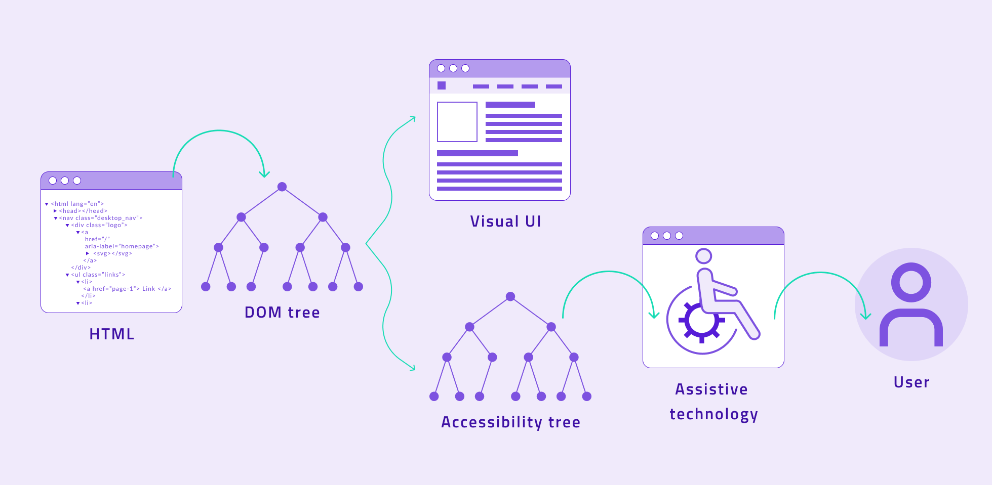
On the other hand, users with visual disabilities can’t do the same. This attribute allows us to specify a textual alternative to these visual controls, which will be read by assistive technologies thanks to the accessibility tree structure.
The aria-label attribute should only be used when the text of a label is not visible on screen. If the element's label text exists and is visible, use the aria-labelledby attribute instead.
This attribute can be used with any HTML element. However, it is not necessary to use it if the element already has a mechanism for labeling its content. For example the <label> element for form elements, or the alt attribute for images.
To illustrate this step, here’s how we should add context to a “fake” button to be completely accessible to all users. If possible, always prefer HTML element rather than role, but for specific case here’s the solution :
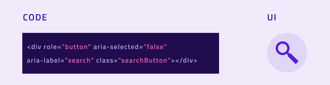
On that element we defined the name, the role and the status :
- Name: Search
- Role: Button
- Status: Unselected
All interactive elements must have a name, you can find examples here.
We only focused here on the aria-label and aria-labelledby attributes but it exist multiple ones as you can see on the non-exhaustive list below:
- aria-active
- aria-atomic
- aria-braillelabel
- aria-brailleroledescription
- aria-controls
- aria-current (state)
- aria-describedby
- aria-description
- aria-details
- aria-disabled (state)
- aria-grabbed (state)
- aria-hidden (state)
- aria-keyshortcuts
- aria-label
- aria-labelledby
- aria-orientation
- aria-relevant
- aria-roledescription
etc.
⚠️ An important note to add, don’t use ARIA if you can do the same with an HTML element, it’s better to not use ARIA than using it badly. If you want to use some, analyse first your components to see if the information is necessary for a full understanding of its role.
7. Style
In general, for visual disability purposes, don’t use text to create a visual effect. Also don’t use color only to convey information, try to match it with an icon and a descriptive text. For graphics for example, provide a legend on what is showcased; or try to use patterns instead of colours.
Provide sufficient contrast between texts and background, to check if there is enough contrast you can use this. Colorzilla is also an excellent tool for extracting the color value from any page element. Additionally, WAVE can analyse contrast ratios for all page text elements at once.
8. Testing
- For contrast checker : Web Aim Contrast checker
- Web accessibility checklist : Accessibility Acceptance Criteria
- Site checker Chrome SEO Extention
- Markup validation service: W3.org Markup Validator
- Chrome Accessibility check plugin
9. Resources
- WCAG Primer
- Ethical Design Guide
- Accessibility Fundamentals Overview
- WCAG 3.0: What you need to know about the future of accessibility standards
- A Toolkit for Web Accessibility
- Check your WCAG Compliance (checklist)
- 5 mistakes to avoid when making your designs accessible
- Accessibilité numérique : des sites web pour tous